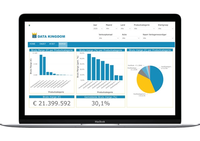
One of the things we are doing in my company is creating a new Dashboard for the SaaS-platform we are offering to our customers. This way, customer data can be made more visually insightful.
Color blindness
In the discussions we had about the Dashboard, it was brought to our attention that one of our colleagues is color blind. For him, for example, it is difficult to distinguish whether a pie slice of a graph is red or green, and where the separation between the values lies.
It turns out that worldwide about 8% of men experience some form of color blindness and 0.5% of women. These do not seem like large percentages, but still means that almost 1 in 10 users (including our customers!) is color blind. So, we must take this into account in the final design. There should be some kind of switch that allows the visitor to switch between a standard color palette or a palette optimized for the most common forms of color blindness. This way everyone will benefit, and we will provide better value for our customers.
User Experience
This once again shows that a seemingly simple question ("Can you create a dashboard?") can be more complex than you think at first glance. As one of my previous students (now a specialist on User Experience, UX, Michael Ramlal), put it: “Simplifying complex data visualization is easier said than done, especially if you aim for inclusivity. I'm a big fan of Edward Tufte, who, with his minimalist approach, managed to convey the right message visually.”
-- Peter Kassenaar
29 december 2023